







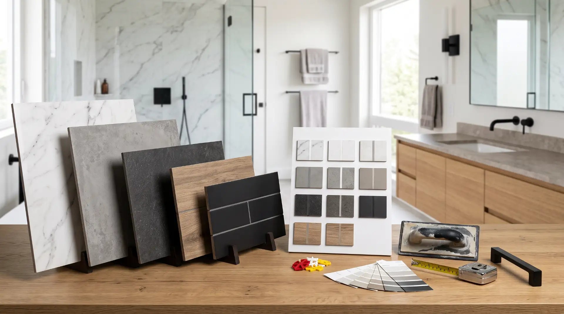
Grout color is a permanent decision made in a five-minute aisle conversation. This guide covers the 3-shade rule, how to pair grout to your specific tile, sanded vs unsanded, and the exact mistakes that turn a beautiful tile job into a two-year regret.

Most bathroom renovation decisions happen in a specific order: tile first, vanity second, fixtures third - and grout color gets picked in the last five minutes of a tile store visit, usually from whatever sample card the installer holds up next to the tile box. That's backwards, because grout color isn't a finishing detail. It's the color that covers 15-25% of a tiled floor's visible surface area, it's the material most likely to visibly discolor within the first two years, and unlike the tile itself, it's genuinely difficult and expensive to change once installed.
This guide covers the decision properly: the difference between matching and contrasting grout, how to choose a color for your specific tile, why sanded and unsanded versions of the same color name can look different on the wall, and the handful of mistakes that account for most of the "I wish I'd chosen differently" messages tile installers hear. If you're reading this before your tile is even ordered, you're in the best possible position - grout color is far easier to get right at this stage than to fix afterward.
If you already have your tile picked out, jump straight to the Grout by Tile Type section for direct pairings. If you're still deciding between matching and contrasting, read the 3-Shade Rule section first - it's the single decision that determines whether the rest of this guide applies to you. The comparison table and FAQ at the bottom cover the questions homeowners ask most before buying.
Every bathroom grout color decision falls into one of six practical families. Picking the family first - before agonizing over the exact sample chip - narrows a wall of 40+ color options down to the 3-4 that actually make sense for your tile and your maintenance tolerance.
Delivers the brightest, cleanest look and pairs with everything, but shows dirt, hair, and hard-water spots faster than any other color. Realistic for shower walls and low-traffic powder rooms - a demanding choice for a daily-use floor.
Reads almost as clean as white but hides considerably more daily grime. The default safe choice when the tile itself is white, light gray, or a pale neutral and you want the grout to stay quiet.
The most-installed bathroom floor grout color in the US - it hides everyday dirt and soap scum far better than white while staying neutral enough to pair with nearly any tile color or undertone.
Minimizes the visual presence of grout lines on dark or large-format tile and reads as a deliberate design statement on light tile. Shows mineral deposits and soap film as light marks - a different maintenance profile than white, not a lower one.
Grout selected to sit close to the tile's own tone, so the grout lines recede and the tile's pattern, veining, or texture becomes the focal point. The correct approach for large-format and natural-stone-look porcelain.
Used with small-format tile - subway, penny, hexagon, mosaic - where the grid pattern is part of the intended design. Black grout on white subway tile is the most recognizable example of this approach.

Every grout color question eventually reduces to one decision: should the grout match the tile or contrast with it? Get this right and almost any specific color works. Get it wrong and no color will look correct - the grout will read as a mismatch even if it's objectively a "nice" shade.
Matching means choosing a grout within roughly 2-3 shades of the tile's own undertone - not necessarily the identical color, but close enough that the grout lines recede rather than draw the eye. This is the right approach for large-format tile (12"x24" and up), natural-stone-look porcelain, and any tile where the material itself - veining, texture, movement - is meant to be the visual focus. Contrasting means deliberately choosing a grout that reads as meaningfully lighter or darker than the tile, so the grid pattern created by the grout lines becomes part of the design. This only works with small-format tile - subway, penny round, hexagon, or mosaic - where there's enough grout line per square foot for the pattern to register as intentional rather than busy.
If you already know which tile you're installing, these are the pairings that work reliably in real US bathrooms - not just on a sample board under showroom lighting. For a deeper look at how tile material affects the whole floor decision, see our guide to porcelain vs ceramic tile for bathrooms.
Buy your grout sample after your tile sample, never before. Grout undertone (warm vs cool) matters more than grout lightness. A gray grout with even a slight blue undertone will fight a warm wood-look or beige tile no matter how closely the lightness is matched. Order both samples and view them together, in the actual bathroom, under the lighting the room will actually have - grout that looks correct under fluorescent showroom lighting frequently reads differently under a bathroom's warm vanity lighting.

The sanded/unsanded choice is driven by grout line width, not color - but it does have a small, real effect on how a given color reads once installed. Sanded grout contains fine sand that adds strength and prevents shrinkage/cracking in wider joints; it's used for grout lines 1/8" and up, which covers most large-format floor tile. The added texture diffuses light slightly, so a sanded grout tends to read as a touch darker and more muted than the same color name in an unsanded formula. Unsanded grout is smoother, used for narrow joints under 1/8" (common on wall tile, glass tile, and polished natural stone that the sand could scratch), and reads marginally brighter and more saturated in the same color.
In practice, this rarely changes which color family you choose - a mid-gray will still read as mid-gray either way. Where it matters is repair and consistency: if you're patching a small area of existing grout, or grouting a floor and an adjoining shower wall from the same color line, confirm you're matching both the color name and the sanded/unsanded type of the original. A patch done in the right color but wrong formula is often still visible once it cures.
Most grout color regret traces back to one of five avoidable mistakes. Catching these before installation costs nothing; fixing them after costs a demolition and a re-grout.
The single most common regret. A daily-use shower or family bathroom floor in white grout looks gray within 12-24 months regardless of sealing.
A cool-gray grout on a warm wood-look or beige tile clashes even when the lightness is a perfect match. Always compare undertone, not just shade.
Grout that looks right under cool fluorescent showroom lights can shift noticeably under a bathroom's warm vanity lighting. Always view the final sample pair in the actual room.
A grout just slightly off from the tile - not close enough to recede, not different enough to be a design choice - reads as an installation error rather than a decision.
Even the right color choice will discolor unevenly without a penetrating grout sealer applied after cure and reapplied annually - see the maintenance section below.
Paint colors change with a repaint; tile doesn't. Anchor the grout decision to the tile and let paint or accessories coordinate to it later, not the reverse.
Grout color decisions don't end at installation - unsealed or poorly maintained grout will drift toward gray or develop dark mildew spotting regardless of which color you picked, which is why sealing is part of the color decision, not a separate step. Cementitious grout (the standard type used in most US bathroom installations) is porous and needs a penetrating sealer applied 48-72 hours after grouting, once fully cured, and reapplied roughly once a year in a shower or wet-area floor - more often in a household with hard water. Epoxy grout, a higher-cost alternative, is effectively stain-proof and non-porous from installation and never needs sealing, which is worth considering for a white or light grout specifically because it removes the discoloration risk that makes white grout risky in the first place.
Daily maintenance that protects grout color regardless of type: a squeegee pass on shower walls and floors after each use meaningfully slows soap-scum buildup, and a pH-neutral tile-and-grout cleaner (never bleach or vinegar on natural stone, and never abrasive scrub pads on colored or epoxy grout) preserves both the surface and the color over time.
You can change grout color without a full re-grout. Epoxy-based grout colorant applies directly over existing, structurally sound grout lines and cures into a stain-resistant, re-colored, re-sealed surface in one weekend project. It only works on intact grout - cracked or crumbling joints need to be removed and replaced first, or the underlying moisture issue will continue regardless of the new color on top.
Every grout color family compared directly on the factors that actually affect daily life with the floor - not just how it looks on the sample chip.
| Grout Color | Hides Dirt | Best For | Maintenance | Avoid If |
|---|---|---|---|---|
| White | Low | Shower walls, powder rooms, low-traffic baths | High - reseal / spot-treat every few months | Daily-use floor or shower base |
| Light Gray | Moderate | White or pale-neutral tile, walls, secondary baths | Moderate - annual sealing | Tile has a strong warm undertone |
| Mid-Tone Gray | High | Primary bathroom floors, most tile colors | Moderate - annual sealing | You want the grout lines to fully disappear on very light tile |
| Charcoal / Black | High (soil) | Dark or large-format tile, statement subway walls | Moderate - shows mineral deposits as light marks | Household has notably hard water |
| Warm Greige / Beige | High | Wood-look porcelain, warm neutral palettes | Moderate - annual sealing | Tile has a cool blue-gray undertone |
| Color-Matched (any tone) | Varies with tone | Large-format & natural-stone-look tile | Same as base color chosen | Tile is small-format and pattern is the goal |
For most US bathrooms, mid-tone gray or warm greige grout on a large-format tile - matched within 2-3 shades - is the choice that still looks right in five years.
It hides the daily reality of a bathroom floor (hair, soap residue, hard water) far better than white, it pairs with nearly every tile color and undertone on the market, and it doesn't demand the frequent resealing that white grout requires to stay presentable. Reserve white grout for shower walls, backsplashes, and low-traffic powder rooms where it can actually deliver the bright, clean look it's chosen for. Reserve contrasting grout (black on white subway, for example) for small-format tile where the grid pattern is genuinely part of the design - not as a default for every bathroom.
Whatever color you land on: buy your grout sample after your tile sample, check undertone (not just lightness) against the actual tile, view both together in the bathroom's real lighting, and seal it properly once installed. That sequence prevents the overwhelming majority of grout regret before it happens.
Finish the Room Your Grout Sets Up
Bathify doesn't sell tile or grout - but once your floor tone is locked in, we've got the vanity, mirror, and hardware finishes that complete the look. Free shipping on orders over $50. Shipped across the USA.


